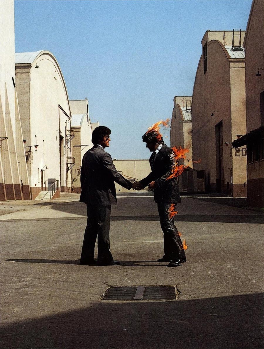
If you were to consider every record or music collection in the world, whether it be modest or extensive, it wouldn’t be an understatement to presume that any one of them, if not the majoriy of them included at least one album that has a cover designed by Hipgnosis; frankly even taking a quick look at how many covers they have actually designed will reveal quite a few more titles than the average collector probably realizes. Such is the extensive body of work that the collaboration between Storm Thorgerson (1944-2013) and Aubrey Powell (and later Peter Christopherson) yielded over their time together. In considering their output it can also not be understated the extent to which they helped elevate the simple act of designing an album cover, to an art form. For the uninitiated Hipgnosis was the art design team responsible for designing some of the most iconic album cover art for some of the most influential and successful musical acts of all time; including arguably one the most recognizable covers in History, Pink Floyd’s Dark Side of The Moon. Their work was not limited to just Album Covers however as showcased in the recently released photographic book ‘Hipgnosis | Portraits’ which acts as a journey into the archives of this influential design company. I got the opportunity to pick the brain of and discuss the motivation for the book’s release with the it’s author, the great, and only remaining member of the legendary team Aubrey Powell.
For the uninitiated Hipgnosis was the art design team responsible for designing some of the most iconic album cover art for some of the most influential and successful musical acts of all time; including arguably one the most recognizable covers in History, Pink Floyd’s Dark Side of The Moon.

Firstly, congratulations on the release of your recent book!
Thank you !
Can you explain the main reason behind its release? How did you find the process of putting it together? Was it difficult selecting which pieces to include?
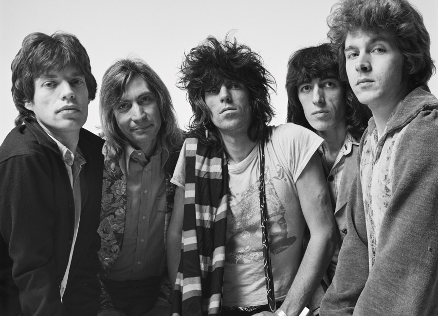
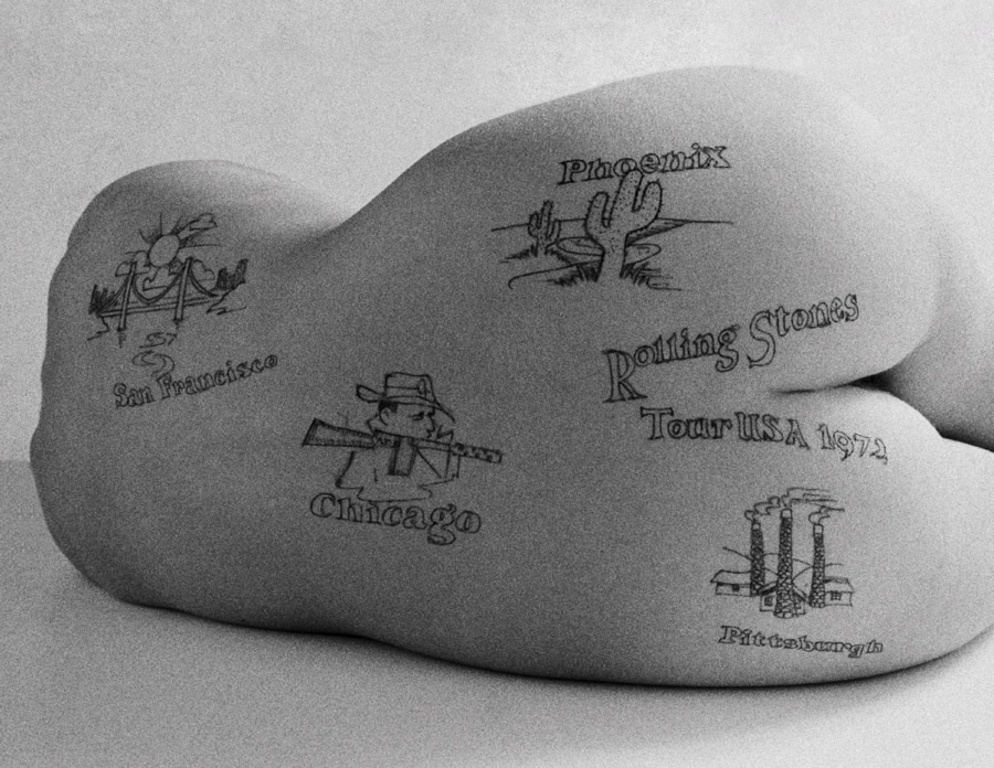
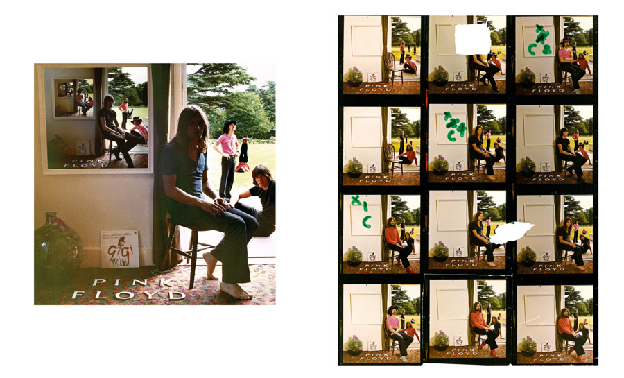
My partner, Storm Thorgerson, and I in Hipgnosis had kept literally hundreds of old files from the 1970’s, the hey day of album covers, which I discovered had many photographs of interesting people and subjects that had never been seen or published. I started to open these old beige folders held together by brittle pieces of Scotch Tape and inside was a treasure trove of pristine negatives, contact sheets and transparencies. One hundred and fifty six photographs of the Rolling Stones taken in 1972 that had never seen the light of day, a hundred odd pictures of Led Zeppelin performing live in Brighton also in 1972, portraits of Peter Gabriel fooling around in a studio, or Pink Floyd in their hey day just prior to the release of Dark Side of the Moon joking around in a park in North London. These gems had been left undisturbed for over forty years. I decided to create a book and the result was Hipgnosis Portraits. The editing process was complicated and assisted by Thames and Hudson the publisher who were fantastic at giving an overview. I was too emotionally close to the project, and sadly, Storm passed away before the book was published, but I know he would have been amazed at what I had turned up.
Hipgnosis is very much known for elaborately designed album covers that would often, almost exclusively not feature the members of the actual band whose album the cover was for. Was this always a conscious decision – were you anti-band portraits as far as album covers were concerned?
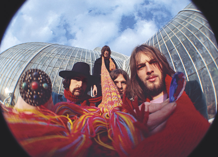
Anti band is too strong a sentiment to place at Hipgnosis’ door in terms of photodesigns. We were just not interested to follow the norm of traditionally having a photo of a rock group on the front cover of an album jacket. We tried to think laterally, out of the box, as to what would make an eye catching an interesting image that would attract the attention of a buyer and yet give a visual flavor to the music. It certainly was a conscious decision. Pink Floyd’s Dark Side of the Moon or Led Zeppelin’s Houses of the Holy are prime examples of design which were motivated by the enigma of the band and the type of music they played. Even Peter Gabriel, who’s first three solo album covers were portraits of a sort, was brave enough and happy enough to sample Hipgnosis at it’s best – distorting the reality of a picture either by water, or by destroying a polaroid of himself, or by the dual reality of him scratching his image out of a picture.
We tried to think laterally, out of the box, as to what would make an eye catching an interesting image that would attract the attention of a buyer and yet give a visual flavor to the music.
Did you see this book of portraits as a way of showcasing Hipgnosis ability to create interesting band shots? To what extent was it important for you to try to engage portraiture on a different level?
The book of portraits was a deliberate attempt to show another side of Hipgnosis; that we had in fact taken portraits of our clients even though they were rarely published. It didn’t interest us particularly, but nonetheless, and in retrospect, we had created a vast library of pictures of music stars of the day, in the prime and their youth. And I think historically and culturally that was exciting enough to warrant a book. Also, many of the pictures in the book are not your regular run of the mill portraits. They were nearly always disturbed in some kind of surreal way.
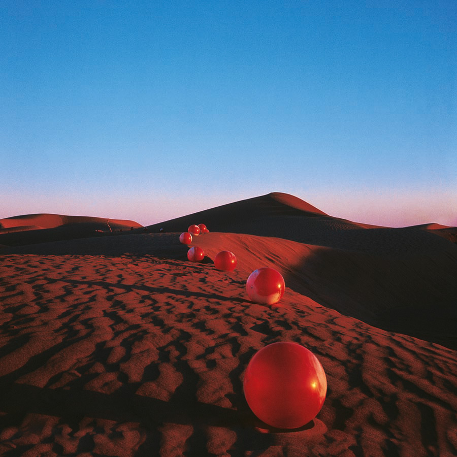
At The Adventure Handbook we’re interested in the story that accompanies a shot as much as the picture itself. One particular story that we wanted to ask you about is related to the Elegy cover shot. Can you elaborate on the story about you and Storm being held up at immigration while trying to get fifty red footballs packed into a suitcase through? Is this true and were these types of situations a common occurrence with most projects or was this the exception?
Can you single out a project that best defines your working relationship with Storm?
There are many album cover designs that Storm and I collaborated on. He was more an ideas man and I was the more tactile sort – in other words I took most of the photographs; although, we often worked together doing both jobs too. One of the first photo-designs that we collaborated on well was for the Nice ‘Elegy’. We took fifty red footballs to the Sahara desert in Southern Morocco and photographed them in evening light against sand dunes and it became an iconic an early representation of the style with which we meant to carry on. Even to this day it stands the test of time and is still one of my favourite and most beautiful shots. And it was all for real. Nowadays you would photoshop the footballs in place and save a lot of money and hassle, but it was very adventurous for the time, both in the trip itself and for an album sleeve. I remember the record company aghast that we had persuaded a band to let us fly off to a distant foreign place for an album cover. They were shocked, and by the costs. Going to the Sahara in the late 1960’s required tremendous effort and was fraught with problems. The customs in Marrakesh thought we were traders and wanted a kickback. Some forty miles from the nearest village in the middle of the Grand Erg desert a policeman turned up on a motorbike and arrested both Storm and myself on some trumped up charge (there was a war going on around the corner with the rebels in some small protectorate) and we spent the day trying to contact the Consulate in Tangier on an antiquated phone that was a scene straight out of the movie Casablanca. A Humphrey Bogart figure turned up to bail us out with $ 200 (a fortune at the time) who turned out to be an American photographer shooting an early BMW car campaign. To find someone in the Sahara to inflate the footballs was challenging enough. A desert truck stop in Zagora at the edge of the desert offered to do it for $ 10, and the following morning we collected all the footballs fully inflated. However, all around the garage lay about twenty young men of the village, exhausted with the exertion of pumping up the red balls with only bicycle pumps, and all through the night, to accommodate us. However, in the end perseverance paid of and we found our shot.
Some forty miles from the nearest village in the middle of the Grand Erg desert a policeman turned up on a motorbike and arrested both Storm and myself on some trumped up charge and we spent the day trying to contact the Consulate in Tangier on an antiquated phone that was a scene straight out of the movie Casablanca.
Was every album cover a purely collaborative affair between you and Storm? Did you always agree?
Storm and I rarely agreed. That was the beauty of our relationship in many ways, although occasionally it led to fistfights and severe arguments, but we always made up within hours and just carried on. Our workload throughout the 1970’s was enormous and it was not unusual to work twelve hours a day seven days a week. We were dedicated. We collaborated on almost everything. Generally we would meet late at night twice a week and thrash out ideas. Storm was a genius at lateral thinking. Then I would go off and photograph the design somewhere around the world. It was a glorious time for album cover designers. Unlimited budgets and the more exotic the idea the more the band would encourage us to get on with it.
Storm and I rarely agreed. That was the beauty of our relationship in many ways, although occasionally it led to fistfights and severe arguments, but we always made up within hours and just carried on.
Do you have a personal favourite cover or band shoot from the Hipgnosis catalogue? If so, can you explain why?
It’s very hard to have favourites when you have so many pieces of work to choose from. Probably working with Peter Gabriel for the album cover Melt was a memorable experience. He wanted a portrait – we didn’t want to do that. It was boring and going backwards as far as we were concerned. However, we agreed on a compromise. We showed him a technique of distorting polaroids by moving around the image whilst the chemicals were still wet. He agreed and with the whole Hipgnosis studio participating by shooting hundreds of polaroids of his face we all attacked his image with gusto. Peter also took part in the process. Afterwards we stuck all the images on a board and Peter chose the one he liked. It was very a ‘art school’ team approach and one which was a lot of fun. Sometimes simplicity gets the best results.


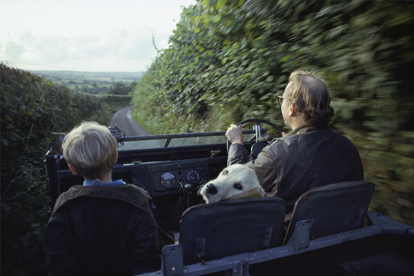
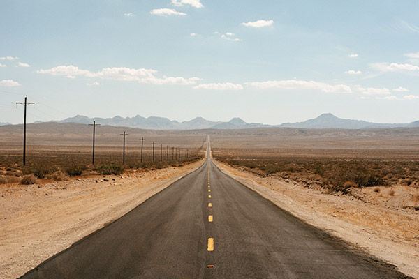
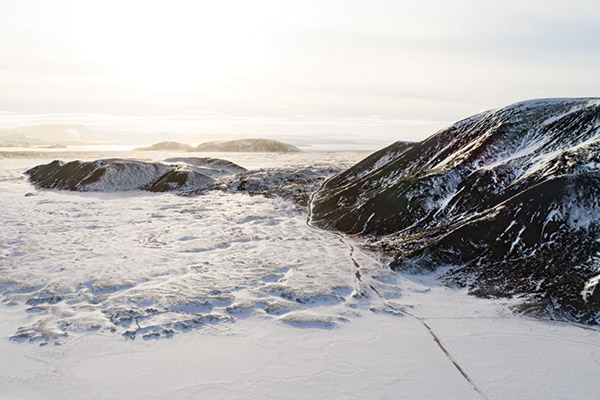
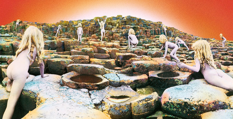
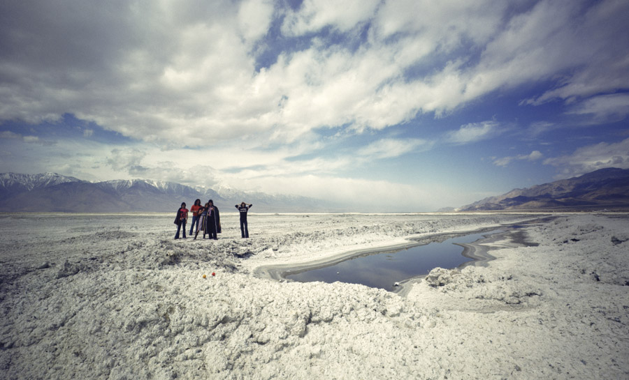
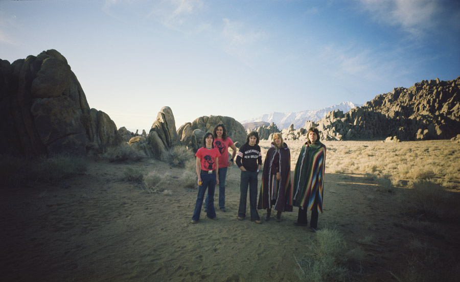
Locations appear to be a crucial element in the Hipgnosis catalogue and in some cases they are the true stars of the covers: Mono Lake on Wish You Were Here; Giants Causeway on House of the Holy; The Sahara Desert for Elegy. Was it important for you to always be pushing the boundaries in regards to location choices?
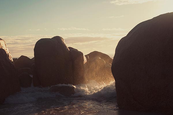
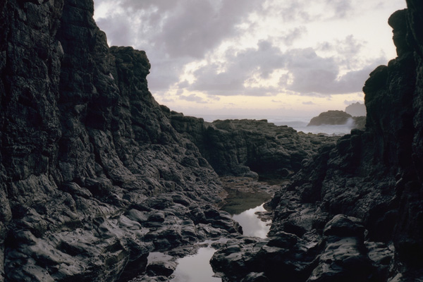
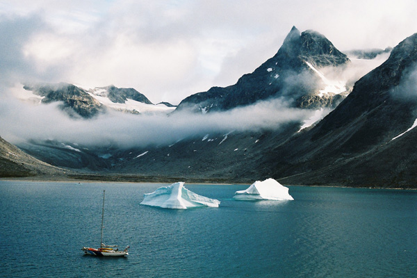
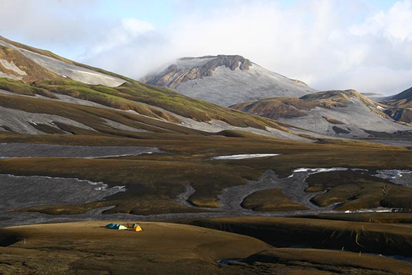
Hipgnosis loved adventure. Going to interesting locations around the world to shoot an idea for an album cover was all part of the crack. Who wants to stay at home when there’s a world out there to explore – and this often paid off. The senses become more acute in foreign climes; the light, the landscape, the isolation, unfamiliar territory or local customs can make you more susceptible to finding interesting compositions, or in the colours and tones you might find in unusual light, for example, in wherever you are shooting. You’re also generally under an intense schedule with financial constraints so every hour counts from sunrise to sunset. Working in extremes of heat or cold, can influence where and how you photograph. Iceland is humid and steamy, Egypt is hot, dry and dusty, Northern Ireland in mid winter rainy, cold and damp, Death Valley unbearably hot. So, the answer to your question is ‘yes, Hipgnosis consciously choose difficult and graphically satisfying locations to push ourselves as a part of the creative process.

I imagine that creative freedom was fairly important to your process. Was it ever a struggle to get that trust from some acts and/or their representatives?
Trust was something that most bands gave us, and I thank them for that. Led Zeppelin, Pink Floyd, Peter Gabriel, Yes, Genesis, Bad Company, 10 cc, to name a few, always gave us carte blanche. Unlike advertising where the world and his wife is involved in any creative decision-making because there is a product at the end to promote, we had no such confines. A photograph of a cow on the front of the Pink Floyd’s Atom Heart Mother, with no title and no band name? Unheard of, but we got away with it because of the interest and fuss that is caused. Reverse psychology. Lateral thinking played a large part in our design process, and I believe this is what attracted us to the caliber of our clientele.
Trust was something that most bands gave us, and I thank them for that. Led Zeppelin, Pink Floyd, Peter Gabriel, Yes, Genesis, Bad Company, 10 cc, to name a few, always gave us carte blanche.
Given the nature of some of your more elaborate work how integral was budget in facilitating the process of getting a cover that matched the concepts you were going for?
It was the 1970’s. A time of plenty. Dark Side of the Moon sold 50 million albums. AC/DC Dirty Deeds Done Dirt Cheap sold six million (another Hipgnosis cover), and Led Zeppelin countless tens of millions. Money was not an object, in fact some of it was to be spent on visuals that were intrinsic to the image of the band. There was no MTV, no digital formats, no You Tube. The cover said it all and we had to back up to pay for it.
How often would the end product match the original concept?
Nearly always. The rough sketches that we did to sell the idea were remarkably accurate to the final artwork.
Working in extremes of heat or cold, can influence where and how you photograph. Iceland is humid and steamy, Egypt is hot, dry and dusty…
The list of acts that you have created covers for is pretty staggering and it includes some of the biggest names in music, ever. Were there any acts that you wanted to work with but never got the chance to? Are there any current or recent acts that you wanted to work with?
There were many people that Hipgnosis would have wanted to work with but didn’t have the chance. Bob Dylan, Bruce Sprinsteen, The Doors, to name a few. But you can’t win them all and we were so privileged to work with the bands who asked us, and some 45 years later to be still remembered for our work. Between 1967 and 1982 we had the halcyon days of album cover design with a fantastic canvas to work with. 12’ x 12’ or a gatefold 24” x 12”. Now it’s a small CD package and even that is diminishing into the digital world where imagery seems unnecessary to the music.
Considering the industry as it currently exists, what with the advent of online streaming services like Spotify and the likes of iTunes being the predominate way people consume music; do you think Hipgnosis could have started or existed in the current climate of the music industry? Is the album cover becoming a lost art form?
Album cover design is over in the way it was celebrated mid 20th century. Hipgnosis could not exist today even with the modern addition of design accouterments’ such as photoshop. The budgets are not there, the canvas is not there, and the interest in photo design surrealist imagery is not there. This partly due to the fact that musicians are often governed by celebrity status now and the portrait has returned as a de rigeur norm. The music industry has such a fast turnover in artists, with little longevity, that there is no place for long term considered design work. Pink Floyd or Led Zeppelin favoured the enigmatic over throughout their careers as a deliberate poly. It’s a different world of music art now, neither better nor worse, but I believe that some day strong visual imagery will return to importance in some form, and fashion and technology will dictate the terms.
I love camera phones. Embrace the technology and move right along. If you’re not up there with the latest gizmo or gadget, give up.
As someone who truly is a pioneer in your field and as someone who is responsible for producing some amazing work that’s been without the benefit of digital aids or Instagram filters; what’s your opinion on the current prolific use of camera phones and the variety of post-production applications.
I love camera phones. Embrace the technology and move right along. If you’re not up there with the latest gizmo or gadget, give up. As a film maker now, and still Creative Director to Pink Floyd, and David Gilmour, I need to have the latest tools by my side, and the support of those who can use them, who are generally young people. If I had had the use of photoshop in 1973 Houses of the Holy would have been completed in an afternoon – not three months. What’s there not to like?
Thank you very much for you time.
Hipgnosis Portraits by Audrey Powell can be found here
Interview by Joel Byrne for AHB
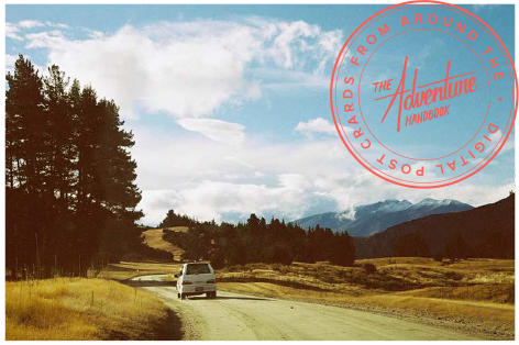
Receive a postcard from us sign up